Dark Mode Email is more than just a trend—it’s a design essential. With over 80% of users enabling dark mode on their devices, ensuring your emails look great in this mode is crucial to the success of your email marketing. As of 2024, approximately 82% of smartphone users prefer dark mode. This trend is also evident across various platforms:
- Desktop Users: 55% favour dark mode.
- macOS Users: 67% have enabled dark mode.
- Android Users: 75% utilize dark mode on their devices.
- iPhone Users: 61% prefer dark mode.
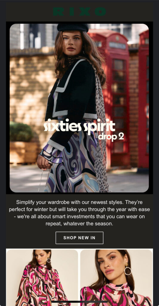
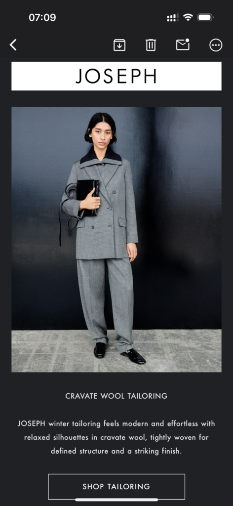
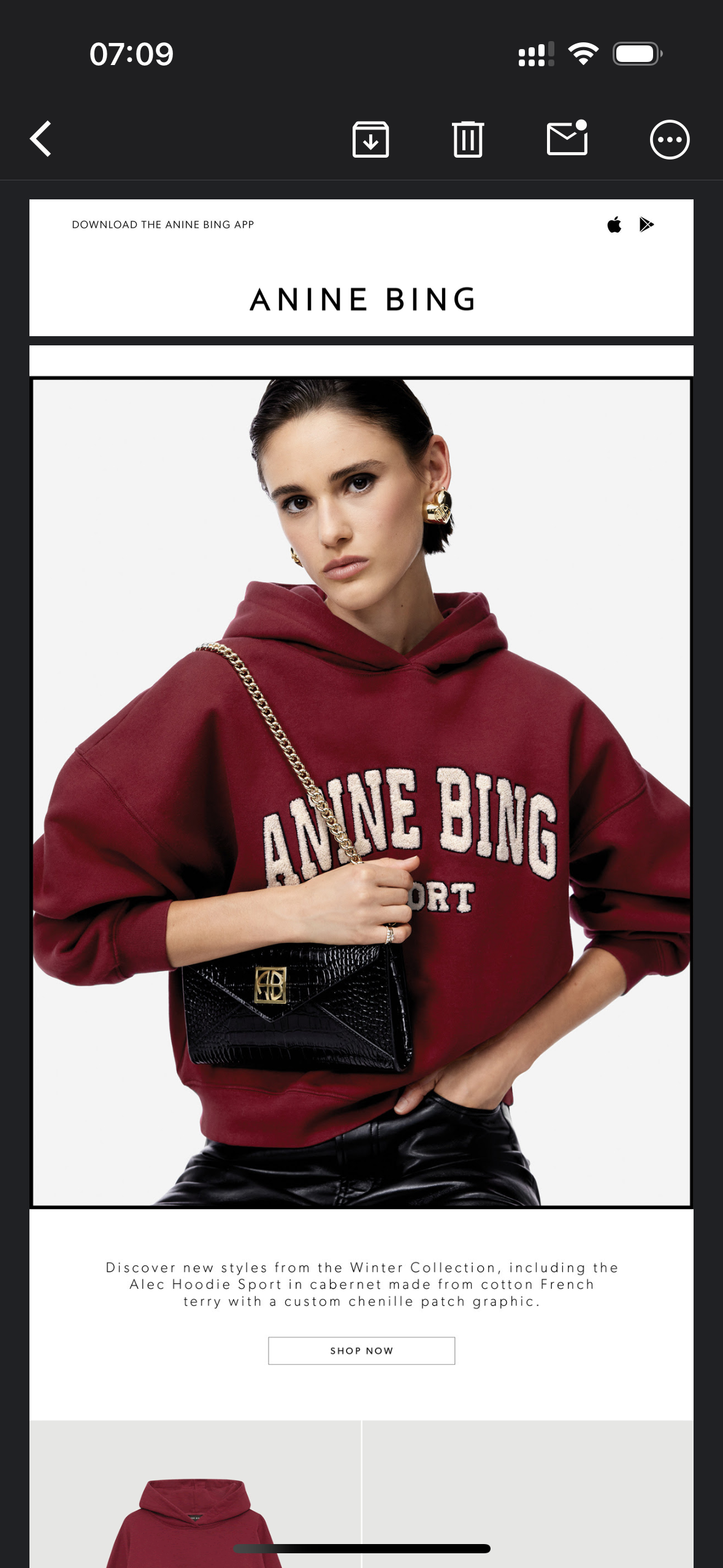
Dark Mode Email is a display setting where the background is dark (black or grey), and text and elements are light-coloured. Many email clients now support dark mode, automatically adjusting email designs to fit the user’s display settings. Without proper optimisation, your emails might look awkward, with mismatched colours or unreadable text. If you’re using Klaviyo to send campaigns, here’s how to create stunning, functional designs that work beautifully in both light and dark modes.
Why Designing for Dark Mode Email Matters
- Improved User Experience: Ensures readability and aesthetic appeal.
- Wider Reach: Appeals to the growing number of dark mode users.
- Brand Reputation: Avoids broken designs that reflect poorly on your business.
Is Dark Mode On All the Time?
No, dark mode is not typically on all the time unless a user chooses to keep it that way. Many devices and apps offer the option to:
- Toggle Manually: Users can switch between dark and light modes in settings.
Schedule - Automatically: Dark mode can activate based on the time of day (e.g., sunset to sunrise) or system preferences.
- Follow System Settings: Apps can match the mode set on your device (e.g., dark mode if the system is in dark mode).
Ultimately, dark mode usage depends on individual preferences and environmental factors.


10 Tips for Designing Dark Mode Emails in Klaviyo
1. Use Transparent Backgrounds
Hardcoding a white background can clash with dark mode settings. Instead, use transparent backgrounds to allow the email client to adapt the background seamlessly.
2. Avoid Pure Black and White
High-contrast combinations like #000000 (black) and #FFFFFF (white) can strain the eyes in dark mode. Opt for softer shades:
- Backgrounds: Dark grey (#121212)
- Text: Off-white (#F1F1F1)
3. Optimise Images with Transparent PNGs
Logos and graphics should be saved as transparent PNGs to prevent white boxes appearing awkwardly in dark mode. This ensures they blend with both light and dark backgrounds.
4. Add Borders to Dark Text
If you’re placing dark-coloured text over light images, add a 1px light border around the text. This keeps it readable in dark mode.
5. Choose Dark-Mode-Friendly Colours
Select colours that maintain high contrast in both modes. Tools like Accessible Colour Checker can help ensure your palette is inclusive and legible.


6. Avoid Hard-Coded Fonts and Colours
Let Klaviyo’s dynamic colour settings adapt your fonts and colours to the user’s mode. This ensures smooth rendering across different devices and email clients.
7. Test Your Emails Thoroughly
Use tools like Litmus or Email on Acid to preview your emails in both light and dark modes. These platforms simulate how your designs will render in email clients like Gmail, Outlook, and Apple Mail.
8. Avoid Background Images Behind Text
Background images can cause legibility issues. If you must use them, add a semi-transparent overlay to improve contrast.
9. Optimise Buttons for Both Modes
Buttons need to be visible and clickable in dark mode. Use:
- Borders: To define button edges.
- Contrasting colours: Ensure both background and text remain readable.
10. Understand Email Client Limitations
Dark mode isn’t handled the same way by every client:
- Apple Mail and iOS: Generally handle dark mode well.
- Gmail: May modify colours inconsistently.
- Outlook: Often struggles with dark mode support, especially in corporate environments.
Klaviyo-Specific Tips for Dark Mode Emails
Klaviyo’s intuitive email editor lets you incorporate these dark mode design principles effectively:
- Dynamic Content Blocks: Use for adaptable background and text colours.
- Customisable Buttons: Easily adjust button colours and borders.
- Template Testing: Take advantage of Klaviyo’s preview and A/B testing tools to experiment with light and dark mode designs.
At DO Digital Marketing, we take design best practices into every aspect of our digital marketing strategies, we understand the pivotal role of designing for dark mode emails and improving email marketing strategies. Get in touch today to discuss your email templates.


